Introduction
Great strides have been made recently in making board games more accessible to players with various forms of colour blindness. It’s something often discussed by players and designers alike. However, something that isn’t talked about (in my experience anyway), is how the graphic design can create a barrier to people suffering from other vision problems and dyslexia. So, I wanted to share some thoughts on the subject.
Not all vision issues can be fixed with a pair of glasses. I suffer from an eye problem that makes it difficult to focus on small details (e.g. reading small/unclear text). One of my friends and fellow gamers, Anthony Brown, has similar issues with text; he is dyslexic. Although the cause of our problems are very different, the result is the same: if a game requires too much effort to read the text, it becomes less enjoyable and will usually be sold on, never to be played again. Furthermore, for dyslexics it’s even worse as they can misread rules or effects, which can be frustrating and contribute to a negative play experience.
If a game requires too much effort to read the text, it becomes less enjoyable and will usually be sold on, never to be played again.
With the above in mind, this article focuses on text in games. Text in games is extremely common, particularly in games that use cards with a variety of effects and abilities. So what are the potential pitfalls and how can you make your game text more accessible? I’ll discuss the main points below. You’ll be pleased to know that all text accessibility issues are easily fixed with a little thought and common sense.
Titles vs. Descriptions
I’d like to start with a caveat. It is important to realise that many of the points I will discuss apply primarily to descriptive text (i.e. where there is more than just a few words). For titles and headings, you have more leeway but still bear the following in mind with all of the text in your design.
The Font
First up then is the font itself. Choosing the right font is essential. Don’t use fancy fonts except for titles and headings. Reading more than a few words in an unclear font is very difficult for people with vision issues. Instead, choose fonts that have a simple design and are clear to read.
Sans-serif fonts are preferred, especially if there are lengthy descriptions or the text size will be smaller than is ideal. Also make sure your font has both uppercase and lowercase letters (this will be discussed later).
Text Size
At an absolute minimum, your text size should be 8pt but the larger the better. Try and make your text 10-12pt if you can (depending on the font – some fonts are smaller than others). Similarly, don’t use tiny text in a big area – if you have a lot of space in your text box, make the text bigger and use all of the available space. If you have the odd card that has more text, you can make the text smaller for those specific cards – it is much better to have most of your cards easily readable than none of them.
If you have a lot of space in your text box, make the text bigger and use all of the available space.
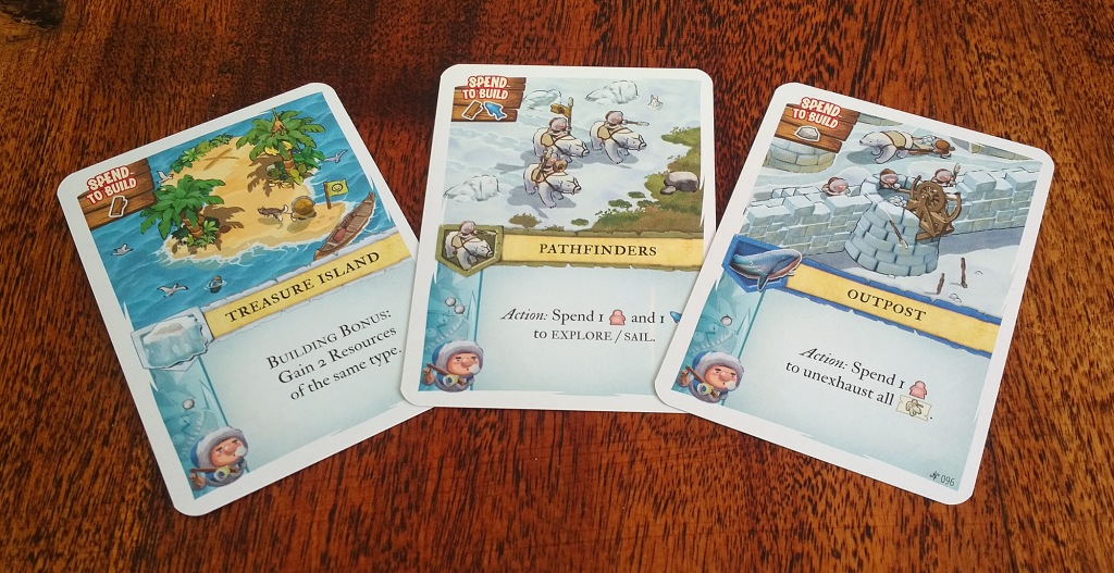
If you have a lot of descriptive text, don’t use small cards or components – scale the components to the amount of text you are using.
Text Style & Formatting

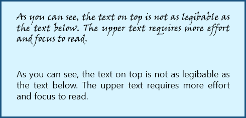
Next up is the text formatting. Firstly, don’t use all-caps for descriptive text (it’s fine for titles and headings though). It has been well established than reading text that is all uppercase requires a lot more effort from the reader.
Similarly, don’t make all of your text bold – this has a similar effect to all-caps. Bold should be used for one or a few words to highlight them.
Line Spacing
Similar to the effect of all-caps, line spacing also affects the white space around the text. Line spacing should be at least the height of the text itself. If there is a lot of text spanning several lines, consider increasing the line spacing to make it easier to read.
Contrast
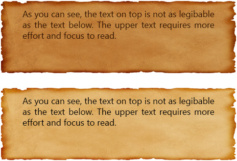
This is a trickier one and there are several problems that can occur. The most common is not having enough contrast between the text and the background. For example, your card might have a fairly dark parchment image for the textbox, and the text might also be a dark brown to make it look more thematic. This can be very difficult to read, especially if the lighting conditions are not ideal. When using backgrounds, try to make sure there is plenty of contrast – this usually means lightening the background and making the text black (or very dark).
Conversely, too much contrast (e.g. pure black on pure white) can also be difficult for dyslexics, especially light coloured text on a dark background (e.g. white on black). The best solution then, is to have black text on an off-white background, or off-black text on a white background.
Furthermore, when using background images for your text, make sure it is a fairly ‘flat’ image. By that I mean that the lightness is fairly consistent across the background (where the text will be). This avoids the issue of varying contrast. For example, a dark patch on the background image will make the text on top of that part very difficult to read anyway, but for dyslexics the change in contrast makes it even more difficult for them as their eyes have to readjust to those changes.
The best solution then, is to have black text on an off-white background, or off-black text on a white background.
Some dyslexics will find certain background colours more difficult to read, but unfortunately there is no rule that can be followed here. Person A might struggle with yellow backgrounds and find text easiest to read on a light blue background, but person B might be the opposite. So when it comes to colour there is no perfect solution, so all you can do is follow the above advice to minimise any contrast issues as best you can.
Rulebooks
All of the above also applies to rulebooks. If your rules are physically difficult to read, it can put people off even learning your game and it might not even hit the table. Also remember that rules are not necessarily read just once to learn the game; players refer to them during play and to refresh their memory between plays.
Consider this, if I am choosing between two games. I need to refresh my memory of the rules for both games: do I pick the one that’s easy to read, or the one with the small text and low contrasting background? It’s not a difficult choice.
Keywords
Unlike the previous points, this one does not relate to the look and style of the text. If your game uses keywords (e.g. to make it easier for players to remember certain abilities and effects), choose words that are not too similar to each other. For example, the keywords Precise and Pierce are similar words and can be easily confused by someone with dyslexia: they could easily get them mixed up because although the text says ‘Precise’, their brain could read it as ‘Pierce’, and therefore they would be using the wrong ability/effect without even knowing it.
Icons
Of course, one way to avoid text issues is to bypass it altogether and use icons. This has the added bonus of making your game more language independent. If you choose this route, reference cards are a must to to help players learn what they mean as they play.
However, icons also come with their own set of potential problems. Obviously you need good icons that represent what they mean, and good descriptions in the rulebook. Also, too many icons can overload players with the amount of symbology they need to learn, so it’s really a judgement call as to whether this is a viable solution for your game.
Conclusion
In short, hard-to-read text is a barrier to enjoying the game, for some people more than others. There are lots of games out there, so people who struggle with the text in your game will simply choose a different one to play.
Do you suffer from dyslexia or vision issues that can make some games difficult to play? If so, please comment below.
Finally, I would like to take this opportunity to thank Anthony Brown for his input into this article and answering my many questions on dyslexia.

Leave a comment